PowerPoint Tips Blog

Helping you with presenting, PowerPoint, and speaking

  • Home
  • Blog
  • Tips
  • E-Store
  • Training
  • About
  • Affiliates
  • Advertise
  • Contact
Home » fonts

Embedding fonts in a presentation with non-standard fonts

October 11, 2014 by Ellen Finkelstein 5 Comments

Are you a font freak? Do you just LOVE interesting fonts? I must admit that I’m a font idiot who can hardly tell the difference between Arial, Tahoma and Verdana, unless they’re right next to each other. Even then, I won’t know which is which. Designers are horrified when I tell them this!

powerpoint--tips-embed-fonts-1Fonts can be fun, but you have to be careful with them:

  • They must be legible!
  • They shouldn’t distract from your message
  • They aren’t necessarily available from every computer

It can be horrible when you open a presentation on another computer and the fonts are all wrong!

What to do?

Stick with safety

You can stick with fonts that are standard on all or most computers. Even then, if you have to switch between PC and Mac, you’ll find that text renders differently and takes up a different amount of space. For example, a line of text will wrap differently — and probably look awful!

Embed fonts

PowerPoint lets you embed fonts. This means that the fonts are embedded in the presentation file and another computer should be able to display them.  There are some limitations. For example, this process only works for TrueType fonts (TTF) and OpenType fonts (OTF). Here’s the technique: [Read more…]

Filed Under: Text & fonts Tagged With: embedding fonts, fonts

8 steps to add branding to your presentations

November 11, 2012 by Ellen Finkelstein 5 Comments

powerpoint-tips-branding-a-presentation-1

When I do corporate training or public webinars, I usually ask attendees to submit a couple of slides. After covering basic principles of how to transform presentations (and the reasons behind those principles), I show makeovers of the submitted slides. The makeovers help people see how to use the principles on their own slides.

powerpoint-tips-branding-a-presentation-1One of the principles that I don’t usually cover at first, but which comes up all the time in makeovers, is branding. A website is branded. A printed brochure is branded. But all too often, presentations use any old colors — whether the default or anything else. Part of the reason is that websites and brochures are designed by professional designers and presentations are often created by presenters who are anything but that.

Large companies do sometimes have professionally designed templates that match their branding but even then, in my experience, presenters often misuse or don’t use those templates, with sloppy results.

Why brand your presentation?

Branding is a big concept and is a way to encapsulate  your company’s identity. One aspect of branding is the visual component, which can include:

  • A logo
  • A tagline
  • Colors
  • Fonts
  • Illustration and photography style
  • Graphic theme

A presentation that outsiders see represents your organization, so it should use your branding. Even for internal presentations, branding can create a sense of shared purpose among the audience members.  Sales presentations often include some aspects of the potential customer’s branding, as well — usually just the logo and colors.

Just as a country’s flag is a way to rally citizen’s around the interests of a country, the visual aspects of branding help to rally employees around the interests of an organization.

How to add branding to a presentation

It isn’t hard to add branding to your presentations and save the results as a theme that you can use over and over. Here are the steps to take to add branding to a presentation in PowerPoint 2007 and 2010: [Read more…]

Filed Under: Backgrounds & color Tagged With: branding, colors, fonts, theme

Design for quick changes–because changes always happen

October 13, 2012 by Ellen Finkelstein 1 Comment

powerpoint-tips-design-for-quick-changes-1

At Presentation Summit 2012, Nolan Haims, Director of Presentation at Edelman (a large PR firm) gave a session called “In the Trenches” about how to design presentations for quick changes and high-end results. His department is responsible for designing presentations that the firm uses to get new clients. Not only do they have to be top quality, but they often need to be changed at the last second. As a result, he has learned how to design presentations in a way that allows for quick changes.

powerpoint-tips-design-for-quick-changes-1Anyone can benefit from this skill, but you’ll find it especially valuable if you create presentations for others or your presentations need to be approved by others.
Here are a few of the points he made.

But before I continue, I highly recommend Nolan’s blog, Present Your Story. I think you’ll find his innovative thinking useful. And you can subscribe to his newsletter here.

Design natively in PowerPoint

By designing in PowerPoint, you allow for quick changes. If you design an image in Photoshop and include text in the image, when you import it into PowerPoint, you can’t edit it. Instead, if you need that image, bring it in without the text and add the text in PowerPoint. Then, you’ll be able to edit it when necessary.

Don’t use custom fonts and don’t embed fonts. Embedding fonts is a way to use custom fonts so that others who don’t have the font can view it. But occasionally,  an embedded font can lock up a file (and not all fonts are embeddable anyway). When you don’t use custom fonts, you increase the chance that your presentation will look the way you want it to look on any computer.

Use theme colors, so you can change the look by changing the colors.  I explain this concept in a blog post, “Create a theme in PowerPoint that changes colors.” You may use a certain set of colors and then be told to change all the colors. If you use the theme colors, you can easily create a new set of theme colors and make the change in a few minutes.

Do you sometimes have to print the slides? Some people present from printed slides and others use the slides in a handout (usually with added notes). If you design templates using PowerPoint drawing objects, everything will print crisply; you won’t have to worry about the resolution of bitmap (also called raster) images. Everything will also look good on screen. You’ve certainly seen bitmap images projected onto a screen that looked grainy. Yes, sometimes you need bitmaps — just be sure they are high-resolution. But when you use PowerPoint drawing objects, you will always get perfectly sharp results. That’s because PowerPoint creates vector images, determined by equations rather than by dots.

Embed charts. Don’t link charts or use images of charts. The reason for this is to make it easier for you to change the underlying data and therefore the chart that displays on the slide. However, you may need a link to allow for quickly changing data — but links are prone to being broken, especially if you move your presentation to another computer. Embedding a chart can make the presentation file large if the underlying spreadsheet.; there can also be security issues. I show 3 methods of adding charts to PowerPoint that are based on Excel data in this YouTube playlist.

Embed videos. You can only embed videos in PowerPoint 2010 and later, but embedding videos will greatly reduce the times that the video doesn’t play.

Use PowerPoint image editing tools. Part of your design probably involves bitmap images such as photos. If you edit the photo in PowerPoint, you can make changes. Does someone want the image to be lighter? Easy! For more details, see my post, “Photo-editing features in PowerPoint 2010.”

When you need to import images…

Of course, sometimes you’ll need to use bitmap images. Use PNGs instead of JPEGs, JPEG is “lossy,” which means that it loses data when you compress it. Theoretically, PowerPoint knows when you have compressed an image within PowerPoint and doesn’t re-compress it, but in some situations, over time, an image can lose info and degrade. Use hi-resolution images of at least 150 dpi (dots per inch). Always test an image in slide show view — and if possible, projected on the screen.

Use vector graphics as much as possible. In practice, this often means using Adobe Illustrator to create graphics that you can’t create in PowerPoint. You can export them in WMF, EMF or EPS format. Nolan recommends the EMF format because it does a better job than WMF  for curves. When you convert an EPS file to a PowerPoint drawing object (by ungrouping) and ungroup it a second time, you get lots of tiny line segments, which are hard to work with.

Top tip and free gift: Gradient boxes

One of Nolan’s top tips for getting a Photoshopped look in PowerPoint is gradient boxes. These are white or black boxes that go from 0 to 100% transparency. I cover the basic principle in my post, “How to get a Photoshopped look by fading in an image.” But Nolan uses these boxes (mostly black ones) at the edges of slides and under text to make the text clearer over an image as well as to make an image blend in with the rest of the slide.

Do you see how the edges of the above slide are slightly darker than the center, creating a vignette effect? Nolan has created a vignette image (yes, done in Photoshop) and given me permission to pass it on to you. Download it here. For a slide that is mostly dark, add this image to further darken the edges and make the center more striking. You can even change the color in PowerPoint!

What techniques do you use to make sure slides are easy to edit at the last minute?


Filed Under: Images Tagged With: changes, editing, embed, EMF, EPS, fonts, gradient, WMF

5 great tools for presenters

April 14, 2011 by Ellen Finkelstein 3 Comments

Jon Thomas, in his blog, Presentation Advisors, has written a post, “My Five Favorite Free Presentation Design Tools,” and I thought I’d share them with you.

  1. Compfight is a tool to search for images on Flikr. letting you easily find images that have Creative Commons or Commercial licenses.
  2. DaFont is a site for free fonts. It always helps to include an original font (as long as it’s appropriate for the topic and legible).
  3. KeepVid lets you download YouTube videos so you can insert them in your presentations, without requiring an active Internet connection. Update: I’ve been told that this program is against the YouTube Terms of Use, Section 4C. (Thanks, @bwasson.)
  4. Note and Point is a site that contains top-quality presentations. It’s a great place to look for design inspiration.
  5. SlideShare is a slide-sharing site. While I don’t think its tools are the best, it has the most traffic, so uploading your presentations there will get you the most traffic.

I just finished a training video on “Getting Your Presentation n the Web” and it included a review of all the major slide-sharing sites. If you’re interested, leave a comment and let me know.

Filed Under: Resources Tagged With: Design, fonts, images, video

Choose fonts and colors for legibility

July 10, 2002 by Ellen Finkelstein Leave a Comment

Solomon Schneider, a faculty member at Sam Houston State University, in Huntsville, Texas, sent me some guidelines for choosing fonts and color to get the highest text legibility.

Color

Medium-colored text + medium-colored background = low legibility. To obtain the best legibility, choose either a very light font on a very dark background or vice versa.

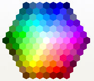
He explains how the familiar color wheel works. (When specifying a font color or shape fill, you get here by choosing More Colors and then clicking the Standard tab of the Colors dialog box. Here it is:

Standard tab of the Colors dialog box

Standard tab of the Colors dialog box

Sol says, “On that color wheel my definition of Very Light is ‘Snow White’ in the center and the Six Dwarfs touching Snow White. Everything outside that first ring of six hexagons is medium until you reach the outermost two rings. All the Very dark colors are on the last two rows furthest from Snow White, although NOT every color swatch on those last two rows is dark.”

He notes, “By my count, 7 very light fonts on up to 35 very dark backgrounds gives 235 high contrast color schemes. Double 235 to cover very dark fonts on a very light background.” So he comes up with a total of 470 legible color combinations.

He adds that “when the audience can’t read text instantly, they quit trying.”

Fonts

Sol provides 5 principles for fonts in PowerPoint:

  1. Wide kerning (the spacing to the left and right of every letter). For example, Verdana has much better kerning than Arial does, as you can see below.
  2. kerning comparison of fonts

    kerning comparison of fonts

  3. At least 28 point text for the slide body for large conference rooms (up to 50 feet).
  4. Sans Serif font, like Comic Sans MS, or Verdana..
  5. NO or minimal font special effects. Absolutely no Shadow font (looks like the projector is not focused). Ever read a book in ALL CAPS? Underlining and Italics are fine for words, not sentences. But the most readable effects are COLOR and BOLD. Avoid the rest.
  6. Many of the Design Templates use medium shades and text with a fuzzy Shadow effect. Don’t use them as a guide to good design.

Filed Under: Backgrounds & color, Text & fonts Tagged With: audience, background, color, fonts, PowerPoint

Free Video Training!

13 Techniques that Will Make Designing Your Slides EASY!

And get the PowerPoint Tips Newsletter with tips and resources for presenters. Plus 5 bonus tips!

BirdSend Email Marketing Tool

PresenterMedia

1-on-1 Presentation Coaching

Recent Posts

Recent Posts:

Recent Posts

  • New SmartArt layouts, including numbered lists and Meet the Team options
  • New Remove Background options in PowerPoint
  • Managing complex backgrounds
  • Creating images with AI: The end of stock photo sites?
  • Format multiple headshots for consistency

Connect with me!

Connect with me on LinkedIn!


Search the site:

Search the site:

Ellen Finkelstein, Inc. · Fairfield, IA · Tel: 515-989-1832

Privacy, Refund, and Other Legal Stuff